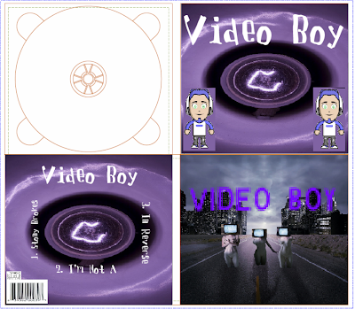
I changed my final design quite a lot compared to my first draft. I decided to add not much colour to go with the theme of “Video Boy” as the character is someone who is dealing with the struggles of life; therefore I used grey, white and black colours for the entire digipack so it would give a dreary/dull feeling.
I chose to make the background for the back and inside cover look like a chalk board so it takes everyone that sees that album back to their school years, and how simple life was back then. The front covers image is very artistic and looks slightly futuristic. Therefore when you look at the front cover it brings the audience into the future, however when you look on the inside and the back of the album it will take the audience back to the past. I chose to include the video boy character on the inside of the album as I didn’t feel my character went with the front cover of my album.
I chose white text so it stood out on the black and grey backgrounds. I also made it look slightly italic so it’s not a standard type of text, but looks different. This also helps it to stand out more. On the front cover I chose a static looking text so that it relates to the title “Video Boy” as static can happen in videos, also it just gives the front cover an interesting look.
I included the barcode and the compact disc logo on the bottom left hand corner of the back of the album. I chose to put these here as in most other album these specific aspects are usually placed around the same area.
However there are some things that i feel i could have done better. I feel that I should have put much more information onto my digipack. Such as information about the artist and some information about the songs such as running time. As well as this, I feel that my front cover could have been a lot better. It's very plain and there isn't many interesting things going on in the background. Although I do feel that this is a good thing as people may be distracted if there are too many things going on in the the background of the front cover. This could take them away from buying the digipack which is not what I want.
Furthermore, I do feel that by keeping my digipack design quite simple, it is similar to other digipacks. Such as "The Black Keys" digipack.
This is similar to mine as it is quite simple but effective. It only uses a picture and some text on the front cover so that people aren't distracted by anything else. This makes people read who the artist is and also makes them want to pick up the album and take a look at what is inside.
By using the font I used I feel that it isn't hard to read and yet goes with the theme of the cover and rest of the digipack. "The Black Keys" album uses a similar technique, it's front is easy to read and matches the rest of the cover.
I set myself a date of when my final digipack was to be completed. Therefore I had around 2 weeks to complete my digipack which I stuck to and it gave me a lot of time to make a first draft and then change that first draft to give me my final and finished product and make sure it was to a good enough standard.
I think my product fits well with my target audience of 16-30 year olds and both can relate to the concept of the product which is past and future. Also the product is more mature than my first draft therefore 16-30 can both enjoy the design of the album.

No comments:
Post a Comment